Advertisements are page layout design problems that promote a product, company or its services. Creating an effective solution that quickly communicates the who, what, when, where, why, and how of an advertiser’s message represents a unique challenge for the graphic designer. Strong visuals must be incorporated to draw viewers into the composition, while well-written headlines reinforce the visuals and entice them to read further. Most importantly, effective advertisements should establish a clear hierarchy of information. Always be sure to contact the publication in which the ad will appear to confirm the dimensions of the ad and by what means it will be reproduced. Advertising space varies in size from fractional pages (such as one-quarter, one-half or one-third page) to a full-page spread, sometimes spanning multiple pages or spreads. Designing newspaper ads can be more of a challenge for the designer in that they are usually specified in “column inches,’ which allows for flexible sizes depending on the publication. To determine the exact dimensions for one of these ads, divide the column inches by the number of columns wide to determine the height of the ad—for example, a 36 column-inch ad may be 12” tall and 3 columns wide or 9” tall and 4 columns wide.
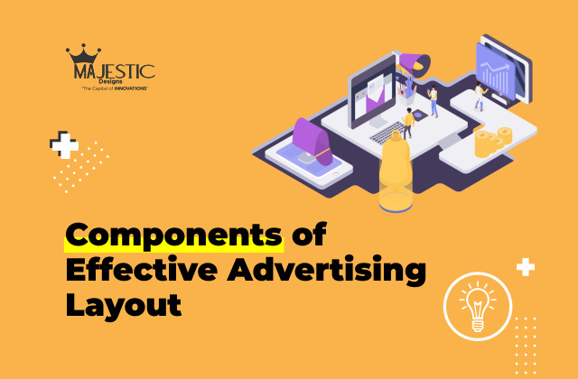
Components of Effective Advertising Layout:
1. Headline
Appealing to the audience’s emotions or intellect with a well-crafted and conceptual headline will make for a more effective advertisement.
2. Logo
The client logo should always appear on sales promotions or ads, as they identify a company or organization and establish consistency in visual communications.
3. Body copy
Supporting copy should be concise and to the point, and a clear hierarchy of information must be presented to the viewer.
4. Strong visual or graphics
Arresting photography or illustration makes the ad stand out from surrounding competitors. Likewise, a lot of white space can have the same effect, depending on the surrounding material.
5. Violators
Starbursts, turned-page graphics, and bold, garish colors are all effective ways to call attention to a piece of information. These are called “violators” because they typically do not resemble any other element on the page. These must be used with caution, as they are not appropriate for every ad. For example, they can disrupt an elegant solution, so use them wisely.
6. Call to Action
What do you want the viewer to do—make a phone call? Visit a website? To inspire a reader to action, it is important to first entice viewer interaction with a piece.
7. Contact information No matter how clever or well designed, if an ad does not give the viewer a way to contact the company for more information, it will fail to attract new customers.