Here are the 6 Graphic Design Essentials!
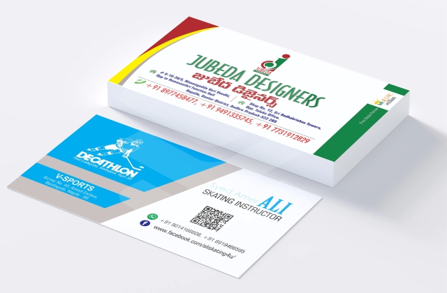
BUSINESS CARDS
Business cards are a low cost way to make a great first impression. They are simple things, just a small card with your brand name and contact information, but they carry a huge weight. 72% of people will form judgments on your company based on your business card, and 28% will simply avoid doing business with you if they think it is ugly.
90% of business cards are thrown away within a week, but doing away with them completely is not the solution. “The trick is to elevate each design beyond normal expectations.”
BROCHURES, LEAFLETS, & FLYERS
In this digital world, print is still very much relevant. Daily Appliance use has left us slightly casual about the information we receive during screen time, internet exhaustion Up to 80% of leaflet recipients keep, pass on, or read leaflets. Brochures, on the other hand, are often decried as expensive. However, they are relatively low-cost and still highly effective. People prefer pocketing and reading trifold brochures than in-depth service catalogs.
SOCIAL MEDIA POSTS
You are missing out on a lot of marketing if you are not uploading graphics to your social media pages. Tweets with images are 150% more likely to be retweeted, and Facebook posts with images see 2.3 times more engagement than those without images.
INFOGRAPHICS
Infographics can boost your web traffic up to 12%, while — get this — people following instructions with text and graphics do 323% better than people following purely verbal directions. People also tend to share infographics online, three times more than any other type of visual content.
STATIONERY
You can keep your voice on-brand by designing correspondence accordingly. Graphics can go on your printed letterheads, custom envelopes, or online email graphics.
Don’t just get your message across, do it with style. That way, you win the confidence of your recipients. Not convinced? Well, emails with graphics have a 25.16% higher open rate and a 4.11% higher click-through rate. The more visually pleasing your text is, your message has a better chance of being actually read.
SLIDESHOW TEMPLATES
In a poll of over 400 public speakers, 84.3% said their slideshows were more visually focused, with each presentation only a quarter-filled with text. However, they admitted to spending anywhere from 2 to 8 hours creating these slideshows.
Every business needs a slideshow design template they can use and re-use in meetings. With proper rules of imaging, typography, and colors already in place, presenters can then focus on the content without having to spend hours on layout every time.

